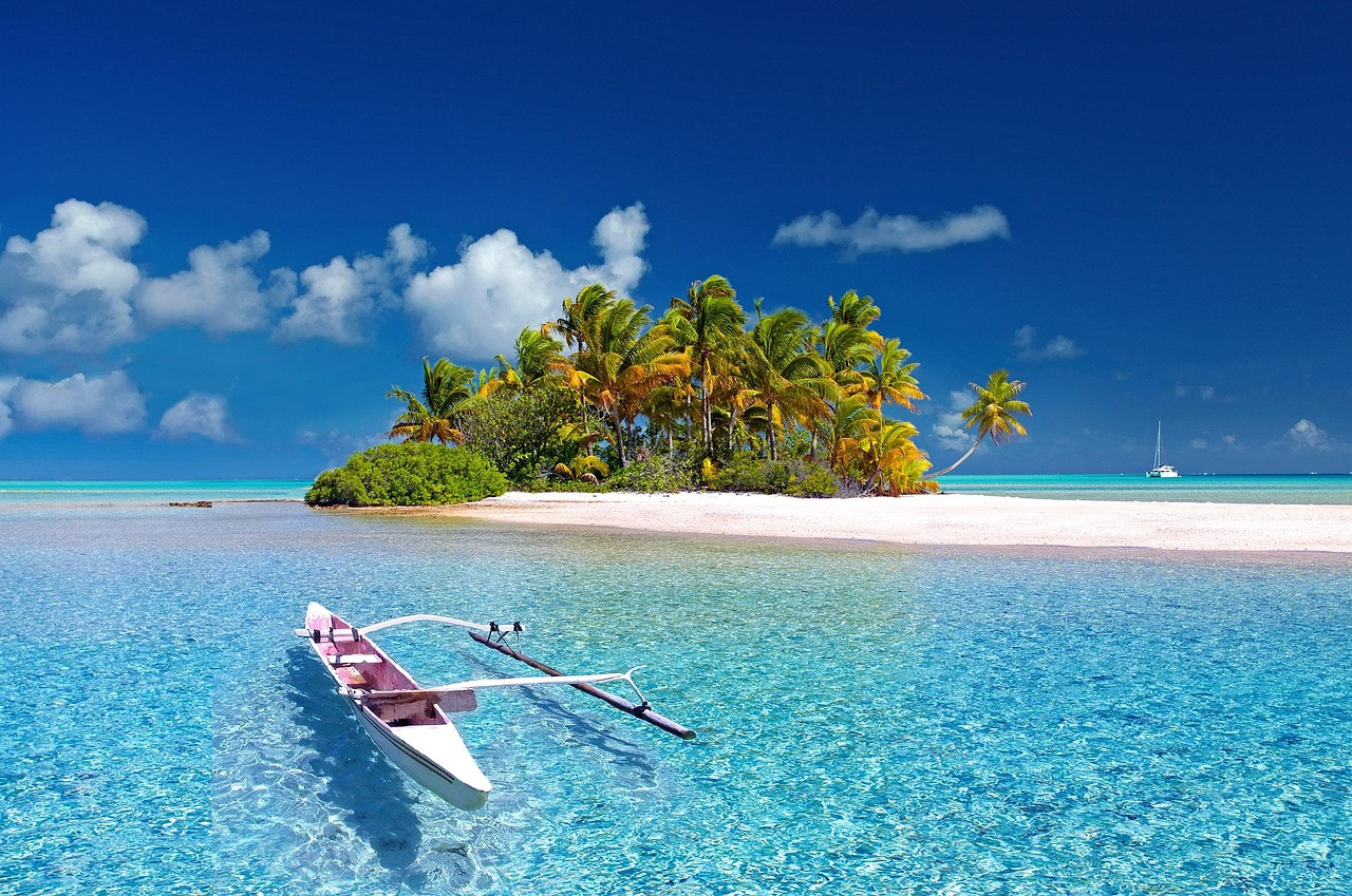
Imagine walking into a room filled with the calming essence of cool blue hues, a palette that not only soothes the mind but also inspires creativity. Cool blue color combinations are not just aesthetically pleasing; they can significantly influence the ambiance and mood of a space. Whether it’s for interior design, graphic design, or fashion, selecting the right cool blue palette can make all the difference. With 2026 bringing forth new trends and technologies, the possibilities for incorporating cool blues into designs are more exciting than ever. From minimalist to maximalist, the versatility of cool blues allows them to fit into any style or theme. Here’s the key thing to understand: the impact of cool blue colors is not just about aesthetics; it’s about creating an experience. Most people miss this when selecting colors, focusing solely on visual appeal rather than the emotional and psychological effects. As we look at the world of cool blue color combinations, it’s essential to consider how these colors will make the user feel. With the right combination, cool blues can evoke feelings of tranquility, trust, and wisdom, making them an ideal choice for a wide range of applications.
📝 What You'll Learn
The Basics of Cool Blue Color Combinations
Cool blue colors are characterized by their calming and soothing effects. They are often associated with feelings of serenity, tranquility, and peace. In design, cool blues can be used to create a sense of distance or professionalism, making them a popular choice for corporate and tech-related branding. The essence of cool blue lies in its ability to blend with other colors seamlessly, creating versatile palettes that can range from monochromatic to complementary.
Here’s a comparison of different cool blue shades and their effects when used in design:
| Cool Blue Shade | Emotional Effect | Best Use | Combination Ideas |
|---|---|---|---|
| Sky Blue | Serenity, Freedom | Backgrounds, Accents | White, Light Gray, Pale Yellow |
| Navy Blue | Trust, Loyalty | Branding, Text | White, Gold, Deep Red |
| Cerulean Blue | Confidence, Wisdom | Highlights, Buttons | Neutral Grays, Earthy Tones, Pastel Pink |
| Steel Blue | Balance, Harmony | Backgrounds, Overlays | Cream, Beige, Mint Green |
The key to working with cool blue color combinations is understanding how different shades can evoke unique emotional responses and how they can be combined to achieve a specific design goal. Whether it’s for digital interfaces, physical products, or environmental design, the right cool blue palette can elevate the user experience.
Top Cool Blue Innovations to Know
1. Monochromatic Blues
Monochromatic color schemes involve different shades of the same color. When it comes to cool blues, this technique can create a cohesive and sophisticated look. By varying the saturation and lightness of cool blues, designers can add depth and visual interest to their work. This approach is particularly effective in minimalistic designs where the focus is on simplicity and elegance.
In detail, monochromatic blues work well because they eliminate the complexity of dealing with multiple colors, allowing the designer to focus on the nuances of a single hue. This can lead to a more refined and polished aesthetic. For instance, a website with a monochromatic blue scheme can use lighter blues for backgrounds and progressively darker blues for text and accents, creating a clear visual hierarchy.
- Simplifies the design process by focusing on variations of a single color.
- Creates a cohesive and harmonious visual identity.
- Allows for easy adjustments in contrast and saturation to ensure accessibility and readability.
Why It Works:
2. Cool Blue and Neutral Combinations
Cool blues paired with neutral colors like white, gray, and beige can create a clean and modern aesthetic. This combination is versatile and can be used in a variety of design contexts, from branding to interior design. The neutrality of these colors allows the cool blues to be the focal point, drawing attention without overwhelming the senses.
In more detail, the use of neutrals alongside cool blues can help to balance out the palette, preventing it from feeling too cold or distant. For example, in a room design, cool blue walls can be complemented by beige furniture and gray accents, creating a balanced and inviting atmosphere. This combination also works well in digital design, where a cool blue background can be paired with white or light gray text for maximum readability.
- Neutrals provide a clean backdrop that lets cool blues take center stage.
- Creates a modern and sophisticated look that is both calming and professional.
- Can be easily adapted to different design mediums and styles.
Why It Works:
3. Contrasting Warmth with Cool Blues
Introducing warm colors into a cool blue palette can add a surprising layer of depth and emotion. This contrast between warm and cool can create visual interest and guide the viewer’s eye through the design. Warm colors like orange, yellow, and red can evoke feelings of energy, happiness, and passion, which can be beautifully balanced by the calming effects of cool blues.
The detail lies in how this contrast can be used to create focal points and draw attention to specific elements of the design. For instance, in a cool blue-dominated interface, a warm call-to-action button can stand out and encourage interaction. Similarly, in interior design, warm-colored furniture can add a cozy touch to a cool blue-themed room, creating a sense of balance and harmony.
- Creates visual interest and can guide the viewer’s eye.
- Can evoke a wide range of emotions and moods.
- Allows for the creation of focal points and highlights within the design.
Why It Works:
4. Metallic Accents with Cool Blues
The addition of metallic accents to cool blue color combinations can add a touch of luxury and sophistication. Metals like gold, silver, and copper can introduce a sense of elegance and modernity, complementing the cool blues and enhancing the overall aesthetic of the design. This combination works particularly well in high-end branding, packaging, and interior design.
In greater detail, metallic accents can be used to create highlights and add a sense of depth to the design. For example, a cool blue website background can be paired with gold navigation buttons, creating a sense of premium quality and exclusivity. In product design, metallic accents on cool blue products can give them a futuristic and cutting-edge appearance.
- Adds a sense of luxury and sophistication to the design.
- Can introduce a modern and sleek aesthetic.
- Provides an opportunity to create subtle highlights and add depth to the design.
Why It Works:
5. Pastel Cool Blues for Soft Aesthetics
Pastel cool blues offer a softer and more subtle approach to design. These gentle hues can create a calming and serene atmosphere, making them perfect for designs aimed at a younger audience or those requiring a soothing ambiance. Pastel cool blues can be combined with other pastel colors or neutrals to achieve a delicate and charming visual identity.
The beauty of pastel cool blues lies in their versatility and the ease with which they can be paired with other colors. For instance, a pastel blue can be combined with pastel pink or yellow to create a playful and youthful palette, ideal for children’s products or nursery designs. In digital design, pastel cool blues can be used for backgrounds or accents, adding a touch of whimsy and approachability to the interface.
- Creates a soft and calming aesthetic that is pleasing to the eye.
- Can be easily combined with other pastel colors for a playful look.
- Provides a subtle and soothing alternative to brighter, more saturated cool blues.
Why It Works:
Real-World Benefits
✔ Improved Aesthetics Improved Aesthetics
Cool blue color combinations can significantly enhance the visual appeal of a design, making it more attractive and engaging. By selecting the right palette, designers can create a unique and recognizable visual identity that stands out from the competition.
✔ Emotional Connection
Cool blues are known for their calming effects, which can help create an emotional connection with the target audience. By understanding the psychological impact of cool blues, designers can craft designs that evoke the desired emotional response, whether it’s serenity, trust, or creativity.
✔ Versatility
Cool blue color combinations are incredibly versatile, suitable for a wide range of design applications, from corporate branding to personal projects. This versatility allows designers to experiment with different shades and combinations, ensuring that their design is both unique and effective.
✔ Professionalism
Cool blues, especially in their darker, more saturated forms, convey a sense of professionalism and sophistication. This makes them an excellent choice for designs that aim to project authority, reliability, and expertise.
✔ Adaptability
Cool blue color combinations can be easily adapted to different design trends and styles, ensuring that the design remains relevant and modern. This adaptability is crucial in today’s fast-paced design environment, where trends and technologies are constantly evolving.
✔ Accessibility
When used correctly, cool blue color combinations can enhance the accessibility of a design. By providing sufficient contrast and ensuring that the palette is easy on the eyes, designers can create designs that are inclusive and user-friendly.
The Next 5 Years
- Predominance of Digital Design: The shift towards digital will continue, with cool blue color combinations playing a significant role in user interface and user experience design.
- Evolution of Sustainable Design: There will be a greater emphasis on sustainable design practices, including the use of cool blue color combinations that promote eco-friendliness and reduce environmental impact.
- Advancements in Color Technology: Advances in color technology will enable the creation of new, innovative cool blue shades and combinations that were previously unimaginable.
- Increased Focus on Accessibility: There will be a heightened focus on accessibility in design, with cool blue color combinations being used to create designs that are more inclusive and user-friendly.
- Exploration of New Design Frontiers: The use of cool blue color combinations will expand into new design frontiers, including virtual and augmented reality, where they will be used to create immersive and engaging experiences.
This trend will be driven by the increasing importance of digital platforms and the need for designs that are both aesthetically pleasing and functional. As technology advances, the ways in which cool blues can be used in digital design will expand, offering new opportunities for creativity and innovation.
This evolution will be characterized by the development of new materials, technologies, and design methods that prioritize sustainability. Cool blues, with their calming and natural connotations, will be at the forefront of this movement, helping to create designs that are not only visually appealing but also environmentally responsible.
These advancements will open up new possibilities for designers, allowing them to push the boundaries of what is possible with cool blue color combinations. From new pigments to innovative digital color models, the future of cool blues in design will be shaped by technological innovation. These advancements will
This focus will be driven by the need to ensure that designs are accessible to everyone, regardless of their abilities. Cool blues, with their potential for high contrast and clear visual hierarchy, will play a crucial role in creating accessible designs that are both functional and aesthetically pleasing.
This expansion will be characterized by the development of new design tools, methodologies, and best practices. As designers explore these new frontiers, cool blue color combinations will be at the heart of creating experiences that are not only visually stunning but also emotionally resonant and interactive.
The following table highlights the potential applications of cool blue color combinations in various design fields, illustrating their versatility and adaptability:
| Design Field | Cool Blue Application | Benefits | Future Trends |
|---|---|---|---|
| Graphic Design | Branding, Packaging | Recognition, Professionalism | Digital Integration, Sustainable Materials |
| Interior Design | Wall Colors, Furniture | Ambiance, Comfort | Smart Home Technologies, Eco-Friendly Materials |
| Fashion Design | Clothing, Accessories | Style, Expression | Sustainable Fabrics, Digital Prints |
| Digital Design | UI/UX, Web Design | User Experience, Engagement | AI Integration, Virtual Reality |
Wrapping Up
Cool blue color combinations offer a world of design possibilities, from serene and calming atmospheres to bold and contrasting statements. By understanding the basics of cool blues and how they can be combined and applied in different design contexts, designers can unlock new levels of creativity and innovation. As design trends continue to evolve, the importance of cool blue color combinations will only grow, providing designers with a versatile and powerful tool to craft designs that not only look amazing but also evoke the right emotions and connections with their audience.
The future of cool blue color combinations in design is exciting and filled with potential. With advancements in technology, changes in consumer preferences, and the ongoing quest for sustainability and accessibility, cool blues will remain at the forefront of design innovation. Whether it’s in graphic design, interior design, fashion, or digital interfaces, cool blue color combinations will continue to inspire and influence design decisions, shaping the visual landscape of our world.
Ultimately, the key to successfully incorporating cool blue color combinations into design lies in understanding their emotional, psychological, and aesthetic impacts. By doing so, designers can harness the full potential of cool blues, creating designs that are not only visually stunning but also meaningful, engaging, and lasting.


Leave a Reply